Homes these days are selling like wildfire—the demand is high, but properties are in short supply. Meanwhile, mortgage lenders offer good financing deals, which explains why home buyers are doing whatever they can to get their offers accepted. So, whether you’re an agent or a seller, now is the perfect time to dominate the real estate market.
If you’re planning to sell a property, chances are you’re keen to find a buyer who can give you the best deal. With all the available resources online, selling homes has never been easier. All you have to do is take several pictures of the house, upload them to a real estate listing, and wait for a potential client to drop an offer. While websites and social media are proven marketing tools, many still rely on traditional advertising, such as real estate yard signs.
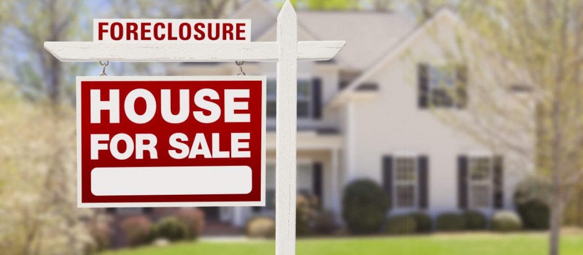
For non-tech savvy sellers, yard signs are the best ways to acquire more leads and build influence amid a competitive housing market. They serve as an on-site sales ambassador while you’re busy marketing your house online. Given these benefits, it’s essential to consider the factors that make a strong real estate sign.
Readability
Well-crafted yard signs have a secret ability: they have the power to communicate and attract potential leads. Thus, your choice of design should enhance the sign’s readability to convey a message to your target buyers.
There are plenty of factors that affect readability, such as font size, style, color, content, and even the white space or the empty area of your sign.
Font choice is a critical element of an effective and highly readable sign. But the rules for signage are a bit different compared to graphic design. To enhance readability, signage should be big enough to be seen from a moving car or a far distance. Otherwise, your audience will simply ignore your sign. They won’t waste their precious time to see what your message says.
This applies to all the information included on your sign, such as the phone number, your name, company name, email address, and other pertinent details. If your logo includes texts, consider using sans-serif or straightforward serif.
White space also affects the readability and aesthetics of your sign. It refers to the empty area without text, shapes, color, or lines. Have you ever noticed how a sign is difficult to read if it’s filled with text or graphics? The face area of your sign should devote at least 30 to 40 percent of white space to achieve optimal readability and bring a sense of breathability and ease.

Graphics
Any images or graphics incorporated in the sign should be selected carefully. It can be a logo, an eye-catching photo, or any significant feature of the house.
A great technique is to print vinyl signage with photos of the house interiors. This is a great way to attract homebuyers without using a lot of words.
Most real estate agents include their headshot on their signage. This approach will help people get to know you better, feel at ease when reaching out to you, and associate your image with your brand.
Whatever graphics you use, make sure they serve a significant purpose, or else they’ll simply clutter your sign.
Color
Just like any design element, colors play an essential role in real estate signs. Your color choices should have the power to make your sign readable and attention-grabbing.
The key is to combine your brand color with contrasting hues to make the sign pop. For example, bold and light greens, oranges, and blues easily catch attention, while drab or dark colors can go unnoticed.
If you can’t think of a suitable color combination for your signage, you can use your brand’s most prominent color. From there, you can use the color wheel as your reference to find the most legible color combination. But be sure that your color choice won’t clash with your text and logo.
Location
Last but not least is the location. The area and the direction in which you position your sign make a big difference. The suggestions above will go to waste if you place your sign somewhere hidden.
When finding a great spot to place your sign, look for a spot that offers the highest visibility. Ideally, the sign should be seen along the street and nearby roads or intersections. Choose areas that won’t conceal your sign by trees, bushes, shrubs, passersby, cars, or buildings.
While digital marketing is a critical part of selling homes, traditional advertising tools such as yard signs are still considered an effective marketing strategy to reach potential buyers. They can speak for your brand even if you’re not there in person. They’re also a valuable advertising tool that serves an essential purpose for your business.

